Material Design 颜色参考。
调色板 [Google官网文档(需要科学上网)]
1 | <?xml version="1.0" encoding="utf-8"?> |
几个关键颜色的用法
整体颜色
| 颜色 | 色号 | 适用场景 |
|---|---|---|
| Primary color (基色,原色) | 500 / 700 / 100 | 1. 屏幕中使用最广 2. 一般会配一个深色或浅色的色号colorPrimaryDark |
| Secondary color (间色) | 1. 用于标明相关的动作或者信息 2. 一般是主色调的一个更深或更浅的颜色变化 |
|
| Accent color (重点色) | A200 / A400 / A100 | 重点色一班用于FAB和互动的元素(文本、游标、文本选择、进度条、选择控制器、按钮、滑动器、连接) |
| Alternative accent colors (备用重点色) | 对于背景颜色太亮或太暗时,使用较暗或较亮的颜色替代 | |
| Primary color variations (原色变化) | 500 | 1. 另一种替代重点色的方案是使用原色的500色号 2. 如果原色已经是500色号了,那么就使用100%的白色或者54%的黑色 |
浅色背景下的深色文字
| Dark text (#000000) | Opacity |
|---|---|
| Primary text (重要文字) | 87% |
| Secondary text (次要文字) | 54% |
| Disabled text, hint text, and icons | 38% |
| Dividers (分割线) | 12% |
| Primary text | #000000 | 87% |
| Secondary text | #000000 | 54% |
| Disabled/Hint text | #000000 | 38% |
| Primary color | #3E50B4 | 100% |
| Accent color | #FF3F80 | 100% |
深色背景下的白色文字
| Dark text (#000000) | Opacity |
|---|---|
| Primary text (重要文字) | 100% |
| Secondary text (次要文字) | 70% |
| Disabled text, hint text, and icons | 50% |
| Dividers (分割线) | 12% |
| Primary text | #FFFFFF | 100% |
| Secondary text | #FFFFFF | 70% |
| Disabled / Hint text | #FFFFFF | 50% |
| Primary color | #3E50B4 | 100% |
| Accent color | #FF3F80 | 100% |
使用透明度替代灰色
- 黑色的文字,设置不透明度为0.54,但是要保证文字和背景的和谐
Icons和其他元素
| Dark icons (#000000)暗色图标 | Opacity 透明度 |
|---|---|
| Active icon 活动图标 | 54% |
| Inactive icon 无效图标 | 38% |
| Light icons (#FFFFFF)亮色图标 | Opacity 透明度 |
|---|---|
| Active icon 活动图标 | 100% |
| Inactive icon 无效图标 | 50% |
示例主题
样式统一色系
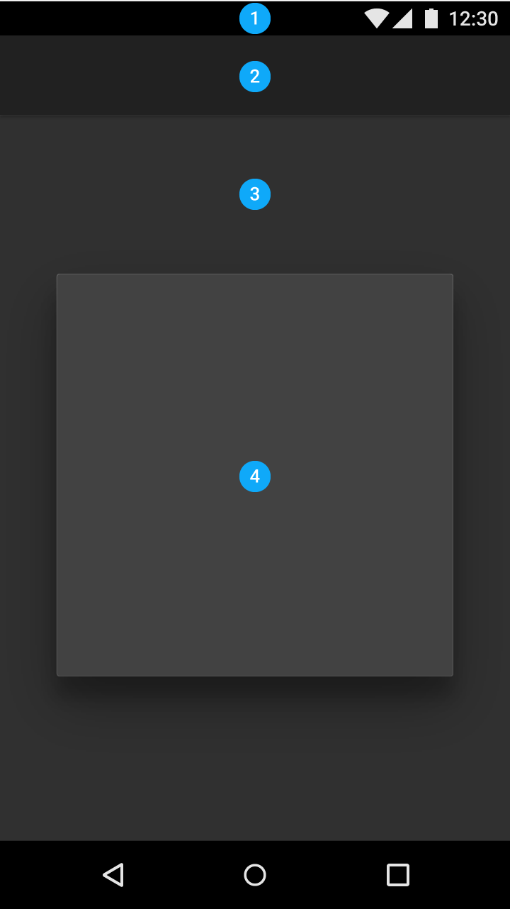
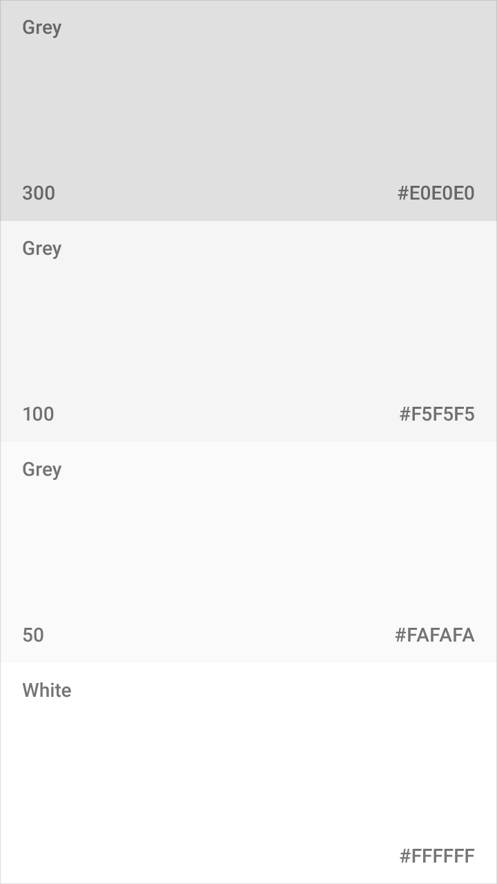
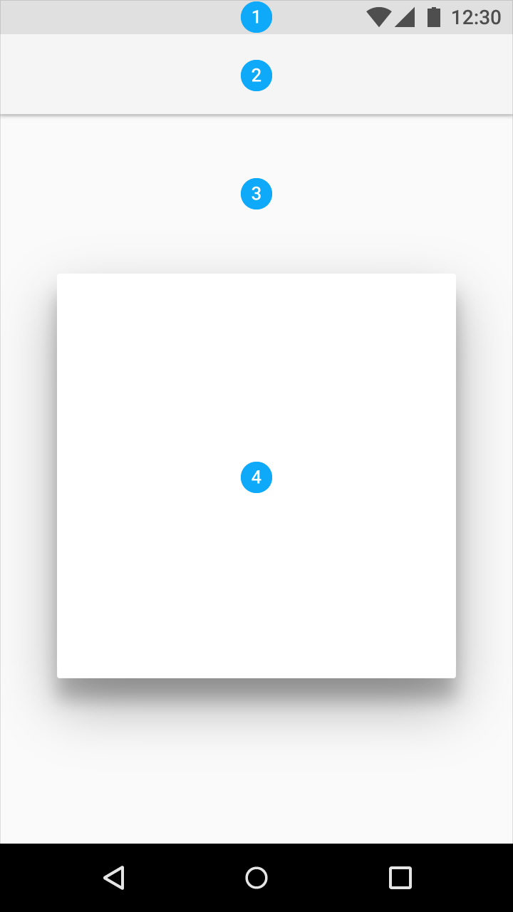
Light theme 亮色主题
| 位置 | 色度 |
|---|---|
| Status bar(1 状态栏) | 300 |
| App bar(2 应用程序栏) | 100 |
| Background(3 背景) | 50 |
| Cards/Dialogs(4 卡片/警告栏) | White |
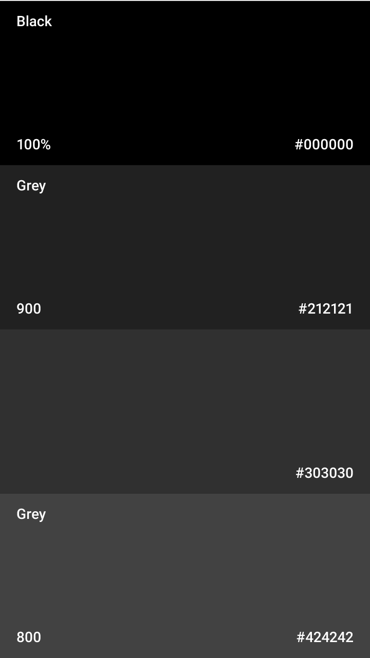
Dark theme 暗色主题
| 位置 | 色度 |
|---|---|
| Status bar(1 状态栏) | Black 100% |
| App bar(2 应用程序栏) | 900 |
| Background(3 背景) | #303030 |
| Cards/Dialogs(4 卡片/警告栏) | 800 |